Variable CSS font features in practice

Modern variable fonts offer powerful capabilities for web typography, allowing adjustments to font weight, slant, and other attributes through CSS without bloating page size excessively. In this guide, which I wrote as a first post on my blog, I’ll demonstrate how I styled text on this website using these capabilities, including
- Setting up and controlling variable font axes
- Working with OpenType font features
- Creating efficient font subsets
- Implementing automatic feature switching based on font parameters
Original image: Typeset by Paul Hudson, Creative Commons license: CC-BY-2.0
I selected Recursive as the font family for my website, and we’ll use it throughout this guide. It is an open source variable font available under the License: OFL-1.1. It saved me a lot of headache about selecting a matching font for headings and for code, since all is included in a single font family.
You can play around with the settings below to get a feel for the effect. You can also edit the text if you want, but I selected the most interesting characters already.
I tried to make the post helpful for beginners and add a bit of exposition about using variable fonts. Click here if you’re only interested in the punchline!
You can grab Recursive from Fontsource via the @fontsource-variable/recursive npm package.
We will create our own subsets from the original font files later to play with some advanced features.
The font comes in relatively heavy at almost 307 kB for the basic latin subset.
I decided to splurge and use it anyway, because it covers all the font styles I’d possibly need for this website – it still beats loading 12 separate web fonts of 30 kB each, for example 😏.
Variation axes
OpenType variation axes are continuous parameters that can seamlessly change the shape of the letters in the font. Recursive defines 5 variation axes:
"wght"- This axis controls the weight of the text.
We don’t have to do anything special to use this axis, because it is mapped to the
font-weightCSS property by browsers automatically. "slnt"- This axis controls the slant of the font1.
I couldn’t get the browser to map this to
font-style: italicproperly, so we’ll have to take care of this axis manually2. "MONO"- This axis blends the font between proportional and monospaced. For values greater than
0.5, monospace-specific letterforms kick in for some characters. Browsers don’t support this axis out of the box. "CASL"- This axis blends the font between serious and casual. Browsers don’t support this axis out of the box either.
"CRSV"- This axis is the most interesting. At
0, you get normal letters, while at1you get cursive ones. At0.5, you get automatic switching: normal letters for upright type and italic ones for text slanted more than 14 degrees3.
The preview below illustrates the variation axes in action. Don’t worry about the custom CSS properties; we’ll get to the CSS for achieving this in the next section.
Custom properties
I generate this static site with Docusaurus, which uses the Infima design system for styling. Therefore, I had to integrate the Recursive font with Infima’s CSS. However, the CSS techniques in this post should apply to other design systems or just plain CSS as well.
The Recursive documentation recommends using CSS custom properties to take advantage of the "slnt", "MONO", "CASL", and "CRSV" axes. This trick is originally from Pixel Ambacht. We can apply it like this:
:root {
  --ifm-font-family-base: 'Recursive Variable', sans-serif;
  --ifm-font-family-monospace: var(--ifm-font-family-base);
  --slnt: 0;
  --mono: 0;
  --casl: 0;
  --crsv: 0.5;
}

* {
  font-variation-settings:
    'slnt' var(--slnt),
    'MONO' var(--mono),
    'CASL' var(--casl),
    'CRSV' var(--crsv) !important;
}
Both the base font family (--ifm-font-family-base) and the monospace font family (--ifm-font-family-monospace) of Infima should be set to Recursive. We’ll blend between proportional and monospace text with the --mono custom property later.
We set "CRSV" to 0.5 by default to take advantage of the auto-switching behavior for italic text. Thus, we’ll be able to format italic text with just the --slnt custom property.
There is an issue here with CSS cascading and shorthand properties. Infima occasionally uses the font CSS shorthand property to set font size and weight. This overwrites font-variation-settings and erases our customizations unless we make them !important.
Styling text
In the absence of support for font-style: italic, we have to map the <i> and <em> HTML tags to slanted type manually:
i, em { --slnt: -15; }
Make sure to format anything you also want to have italic with both --slnt: -15 and font-style: italic so that the text gets properly displayed even if the browser loads a fallback font.
We also make <code> and <kbd> fully monospaced:
code, kbd { --mono: 1; }
Similarly to the Recursive documentation, I decided to use the fully casual style for large headings (<h1>, <h2>). For smaller headings (<h3>), I use a blend between the normal and casual styles, because the fully casual one looked a bit too complex at a small point size:
h1, h2, .markdown > h3 { --casl: 1; }
h3, .markdown > h4 { --casl: 0.25; }
Docusarus shifts the sizes of headings up by one for text generated from Markdown. Thus, we need additional styles for .markdown > h3 and .markdown > h4.
Font features
Some letters now look a little awkward: the two-story letter ‘g’ can be hard to read in small body text. Also, the ’@’ gets squished horizontally in monospace text way too much. There’s even a GitHub issue for that in the Recursive repository!
Handily for us, Recursive has a number of OpenType font features, which are binary switches that can change the shape of the characters. You can take a look at them in Recursive’s README page. I also reproduced the image below, but it’s a bit large, so you’ll need to click to reveal it.
OpenType font features of Recursive
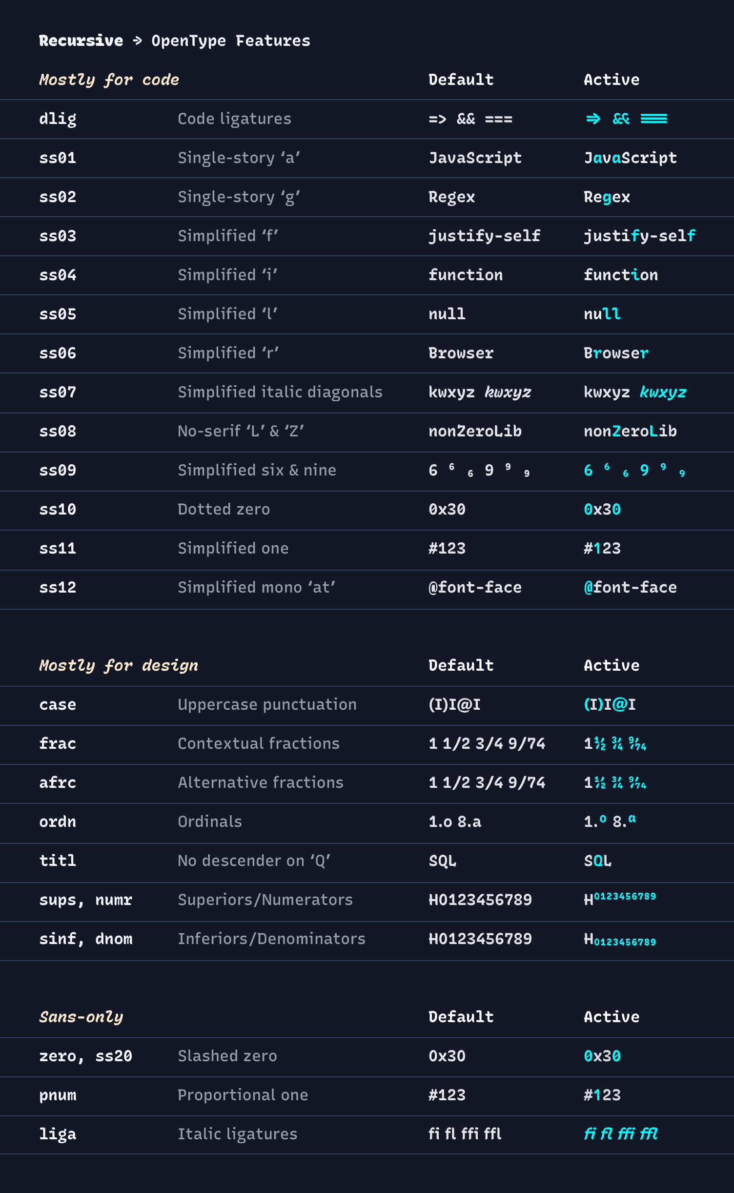
Image from Recursive is License: OFL-1.1.
Intermission: font subsetting
If you’re using Recursive from Fontsource or even Google fonts 😰, the OpenType font features won’t work at all: they’ve been stripped away from the web font files to make them smaller. There’s an open GitHub issue in the Fontsource repository to preserve some features, but the problem is highly non-trivial at their scale.
We can solve this problem by grabbing the full Recursive_VF_1.085.ttf ourselves and creating our own web font. The full font comes in at a whopping 2.4 MB, so I recommend creating a subset with only the glyphs you use.
We can use the pyftsubset tool from the fonttols Python package to create our own web font subset like this:
pyftsubset Recursive_VF_1.085.ttf
  --unicodes=U+0000-00FF,U+0131,U+0152-0153,U+02BB-02BC,U+02C6,U+02DA,U+02DC,U+0304,U+0308,U+0329,U+2000-206F,U+2074,U+20AC,U+2122,U+2191,U+2193,U+2212,U+2215,U+FEFF,U+FFFD \
  --output-file=recursive-latin.woff2 \
  --flavor=woff2 \
  --layout-features+=ss02,ss05,ss10,ss12,titl \
  --desubroutinize \
  --obfuscate-names
I copied the list of --unicodes to include in the basic latin subset from Fontsource.
You can specify the OpenType features (in addition to the standard ones) to include in the output font after --layout-features+=.
We’re creating a WOFF2 web font for maximum compression, which has over 97% browser support. The --desubroutinize option should also help with compression.
The SIL Open Font License 1.1 has an infamous Reserved Font Name (RFN) clause. If you create a Modified Version of a font that has an RFN, you must also change its name. SIL considers a subset a Modified Version.
The --obfuscate-names option should take care of changing the font name in the font file. If you use a font that declares an RFN, you must also make sure not to refer to it with its original name outside the font file, e.g., in your CSS files.
Recursive doesn’t declare any RFN, so we can keep referring to our custom subset as ‘Recursive’ without getting into any trouble. 😌
We can now include our custom subset in our CSS:
@font-face {
  font-family: 'Recursive Variable';
  font-style: oblique 0deg 15deg;
  font-display: swap;
  font-weight: 300 1000;
  src: url(recursive-latin.woff2) format('woff2-variations');
  unicode-range: U+0000-00FF, U+0131, U+0152-0153, U+02BB-02BC, U+02C6, U+02DA,
    U+02DC, U+0304, U+0308, U+0329, U+2000-206F, U+2074, U+20AC, U+2122, U+2191,
    U+2193, U+2212, U+2215, U+FEFF, U+FFFD;
}
For this website, I actually wrote a small Python script to generate the font subsets. I also use a template for generating the corresponding CSS. Both files can be found in the Git repository of this website under License: MIT.
Selecting features
I decided to take the features ss02, ss05, ss10, ss12, and titl for a spin. You can also try them yourself below.
After a bit of experimentation, I ended up using the features as follows:
- The simplified look of the letter ‘g’ with the
ss02feature is suitable for body text, but I prefer the two-story ‘g’ for headings. - The
ss05feature does nothing for proportional text, but makes the letterlmore similar to that in my favorite coding font, Fira Code in monospace text. We can safely set this for all text. - The
ss10(dotted zero) andss12(simplified@) features affect proportional text, too, so we shouldn’t set them for all text. However, they do make text more readable for me once the monospace letterforms kick in after--mono: 0.5. - The alternative ‘Q’ with
titlis nice for headings, but I prefer the default ‘Q’ with descender for body text.
Automatic feature switching
Introducing CSS custom properties for these font features – like we did for the variable axes – would be a major pain when writing CSS by hand.
We can take some inspiration from the behavior of the "CRSV" axis: let’s set the font feature automatically based on the value of some variable axis!
My headings use the "CASL" axis, so I decided to switch ss02 off and titl on if --casl is larger than 0.
For ss10 and ss12, --mono larger than 0.5 gives a natural switching point, since this is where the other monospace letter shapes appear as well.
In short, we want something like
We will use calc() to determine the values of font-feature-settings.
However, looking through the list of CSS math functions, we find few options for creating discontinuous expressions. The round() function sounds promising, but it isn’t wasn’t supported by Chromium until May 2024.
The trick is to replace our expressions with continuous ones that we can build from widely supported CSS functions min() and clamp():
- Code
- Math
* {
  font-feature-settings:
    'ss02' calc(min(var(--casl) * 1000, 1)),
    'ss05' 1,
    'ss10' calc(clamp(0, var(--mono) * 1000 - 500, 1)),
    'ss12' calc(clamp(0, var(--mono) * 1000 - 500, 1)),
    'titl' calc(1 - min(var(--casl) * 1000, 1)) !important;
}
Each CSS expression agrees with the desired discontinous expression everywhere except a tiny interval of width 0.001 around the decision boundary. We position the intervals so that commonly used variable axis values (like 0, 1, and 0.5) don’t cause any problems.
This works as long as we only set --casl and --mono with up to 0.001 precision. Values such as 0.0005 and 0.5005 will likely cause problems, because they try to set a non-integer value for a font feature. In my testing, this made both Chromium and Firefox to ignore the font-feature-settings rule completely.
In practice, we hardly set a value with more than 0.1 precision, because very slight changes in the letter shapes are barely perceptible.
You can set the variables axes below with up to 0.01 precision:
The round() function
Since May 2024, the round() CSS math function became widely available in browsers.
This allows use to write the font feature computations is a more straightforward way, and also avoids the problem of variation axis values like 0.0005 or 0.5005.
The updated code snippet looks like this:
* {
  font-feature-settings:
    'ss02' calc(1 - round(up, var(--casl))),
    'ss05' 1,
    'ss10' calc(-1 * round(nearest, -1 * var(--mono))),
    'ss12' calc(-1 * round(nearest, -1 * var(--mono))),
    'titl' calc(round(up, var(--casl))) !important;
}
We make use of the rounding strategies available to us.
Rounding up will round any nonzero --casl value to 1 (since the values of --casl are always between 0 and 1). The case of nearest is a bit more complicated, since it rounds 0.5 to 1 and not 0 as we want. We work around this issue by first flipping the sign (notice -0.5 is rounded to 0), then flipping it back after rounding.
Conclusion
I’ve shown you how to leverage Recursive’s variable font capabilities in several ways:
- Using CSS custom properties to control variable font axes (
--slnt,--mono,--casl,--crsv) - Creating custom font subsets with
pyftsubsetto maintain advanced features while managing file size - Implementing automatic font feature switching based on axis values using CSS math functions in
font-feature-settings
I also managed to include every Markdown feature and the kitchen sink in this post to try out Docusarus as a static site generator.
While I used these techniques specifically with Recursive for my blog, they can be adapted to other variable fonts (though specific axes and features will vary). If you’re considering a variable font for your project, I’d recommend thinking about:
- Whether you need all axes and features, as they affect file size
- Browser support for the CSS features you plan to use
- Licensing terms, especially when creating custom subsets
For further exploration of variable fonts and advanced typography:
- Variable Fonts Guide on MDN
- Fontsource and v-fonts.com for browsing and testing variable fonts
- A Variable Fonts Primer for further documentation
The CSS techniques demonstrated here, particularly the automatic feature switching using math functions, can be applied beyond typography to create other dynamic design effects based on continuous variables.
FAQs
Why use variable fonts instead of regular web fonts?
Variable fonts like Recursive can replace multiple font files (regular, bold, italic, etc.) with a single file that contains all variations. This can improve page load times and give you more fine-grained control over typography. In this post, I used one variable font instead of loading separate fonts for regular text, headings, and code.
What's the difference between variable axes and OpenType features?
Variable axes (like weight, slant, or width) allow continuous adjustment of the font's appearance. OpenType features are binary switches that enable alternate character shapes or special typographic features. In this post, I showed how to automatically switch OpenType features based on variable axis values.
Why do I need to create a custom font subset?
Web font services like Google Fonts and libraries like Fontsource often strip OpenType features or variation axes to reduce file size. If you need specific OpenType features (like alternative characters or special ligatures), you'll need to create your own subset from the original font file. This also lets you include only the characters you actually use.
Is it legal to create and host custom font subsets?
It depends on the font's license. For fonts under the SIL Open Font License (OFL) like Recursive, you can create and host subsets, but you need to be careful about the Reserved Font Name clause. Always check the license terms and maintain proper attribution.
Footnotes
-
It goes in the direction opposite to the
font-style: obliqueproperty. ↩ -
The mapping of
font-styleto variable axes looks quite complicated: the font matching algorithm forfont-style: italicwill fall back to setting"slnt" -14(the default angle forfont-style: oblique) if the variable font has no"ital"axis. This is just off the mark for us, because we can only take advantage of the"CRSV" 0.5auto-switching for slants bigger than 14 degrees 😞. ↩ -
Actually the slant will still be -14 degrees (the maximum), but the letters will be italic instead of just slanted. ↩